Overview
Suppose you've just built a new audience and deployed them to a campaign. You are probably wondering: What actions are they taking? How has my audience reacted to that new campaign?
The Insights feature enables you to view breakdowns of your members and define campaign success metrics to measure your audience against over time, all within Hightouch. You can track insights on metrics such as:
- Revenue per country
- Number of subscription sign-ups
- Number of inactive members who've recently logged back in
You can then track how these metrics perform over time and compare them across audiences. Insights also works seamlessly with Hightouch Splits. You can set up an A/B test within Hightouch, see how each split group performs, and determine a winner.
This doc provides step-by-step instructions for creating Insight charts.
Understanding the core concepts
Custom metrics (“Saved metrics”)
You can define and save metrics using any event in your data schema. Metrics are defined on a parent-model basis, and you can enable them on any audience built off the parent model.
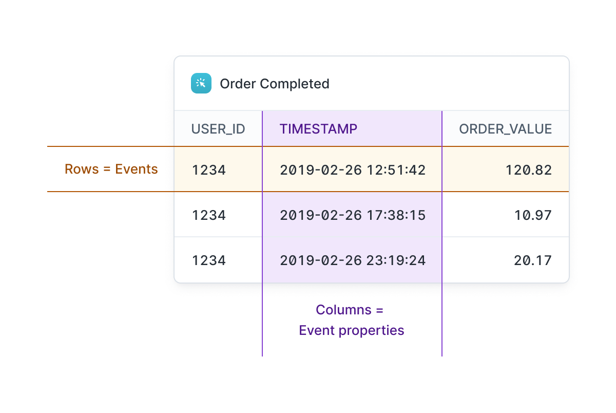
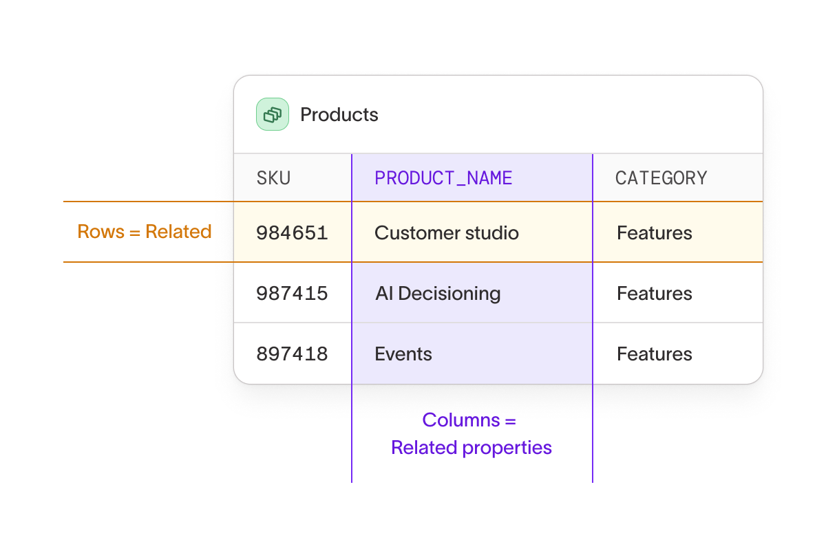
Events and related models
Events and related models provide additional characteristics or actions to filter your parent-model. They're similar, but the key difference is that events require a timestamp. Events and related models contain properties — if you think of each instance as a row, properties are the columns.
Properties
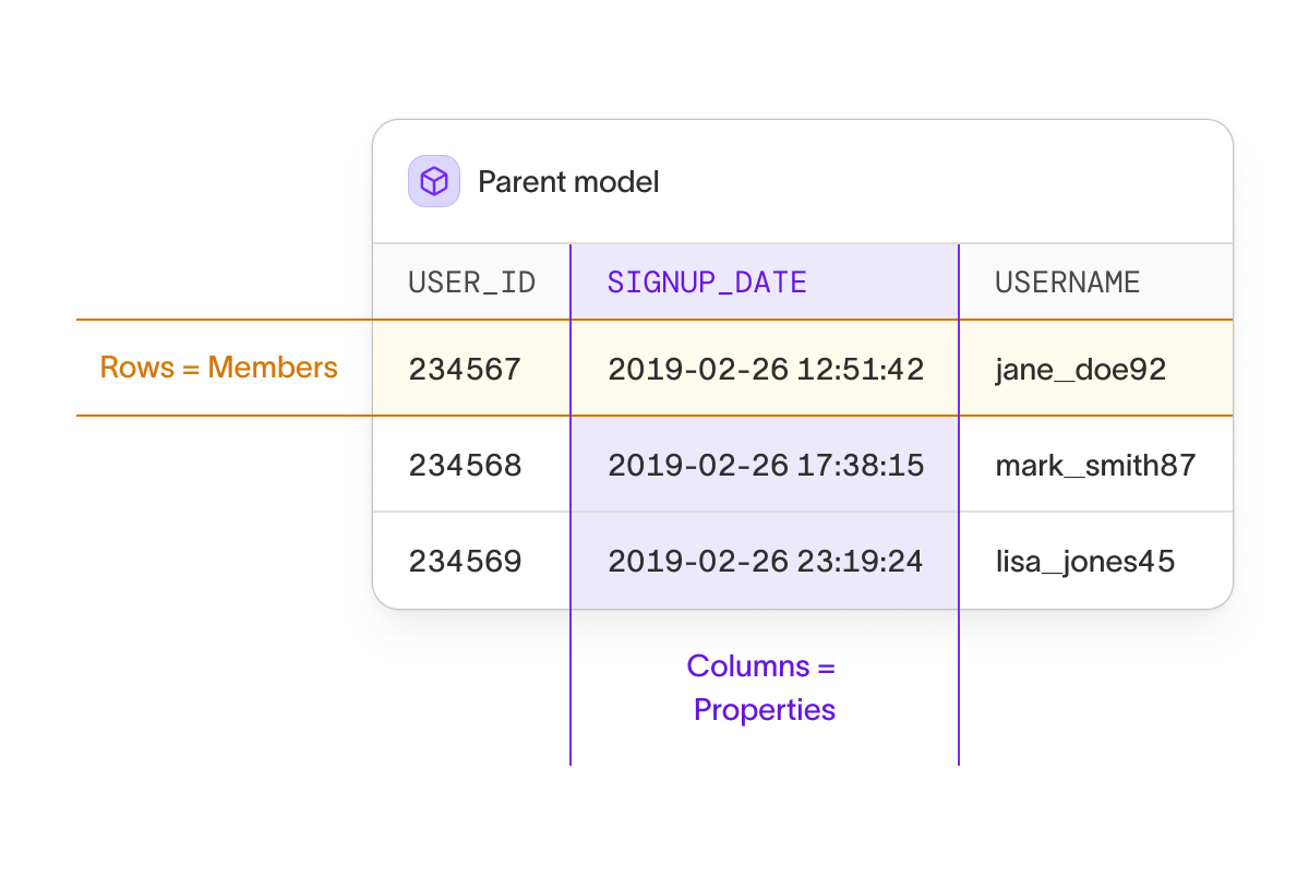
Properties that are defined by your parent model. If you think of each member in your parent model as a row, member properties are the columns.
Traits
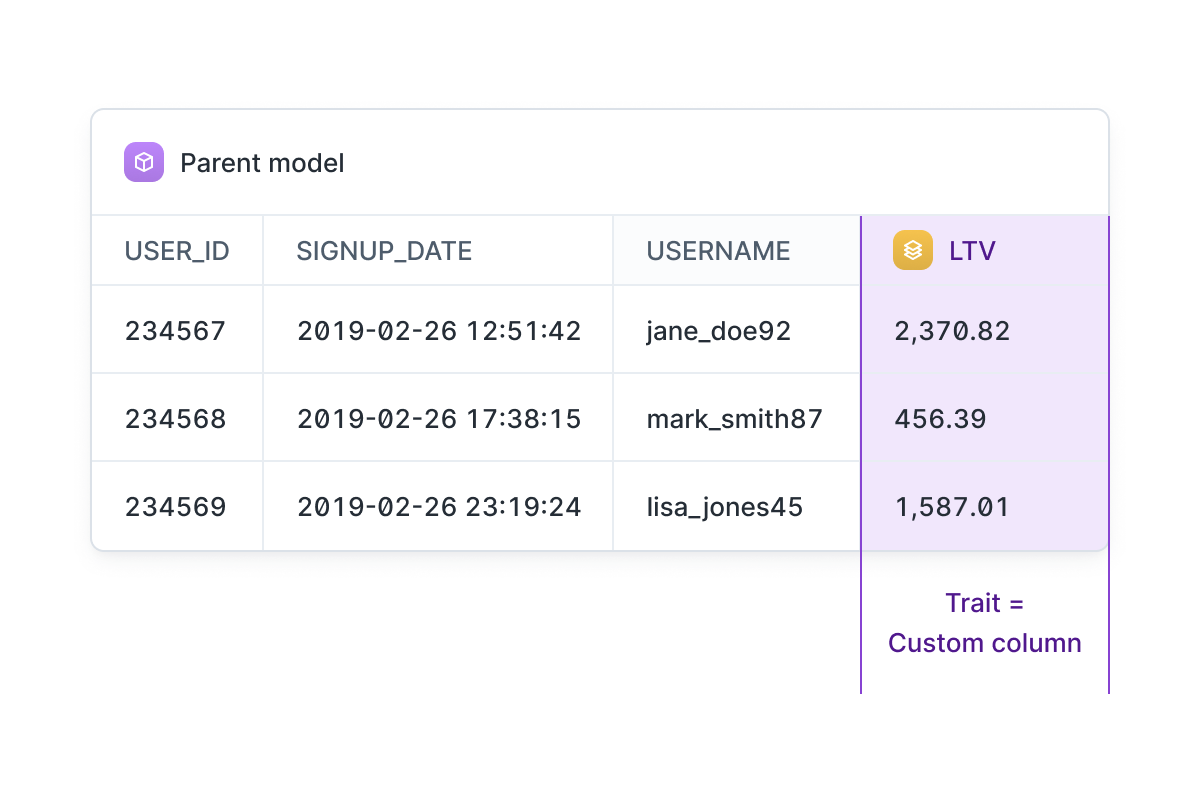
Traits are custom columns added to your parent model.
Getting started with Insights
Within the Charts product, the Insights tab allows you to create these charts. You can also view Insights charts that have already been created and saved.
Metrics and properties
You can base an insight chart off of several different measurement options, and depending on the type you select, you can select an aggregation type, define a measurement window and add filters.
- Aggregation type: Defines how individual instances are combined to form the metric – for example, the total number of rows, unique members, or the sum, count or average of a property.
- Measurement window: Specifies the time period in which the selected metric must occur - for example, measuring an event from audience entry to 30 days after audience exit.
- Filters: Narrow down the data included. Filters are based on the properties of the models you use – for example location, product type, or price.
Saved metrics
Saved metrics already include an aggregation, so additional aggregations can't be applied within Charts. However, you can change the measurement window and filters.
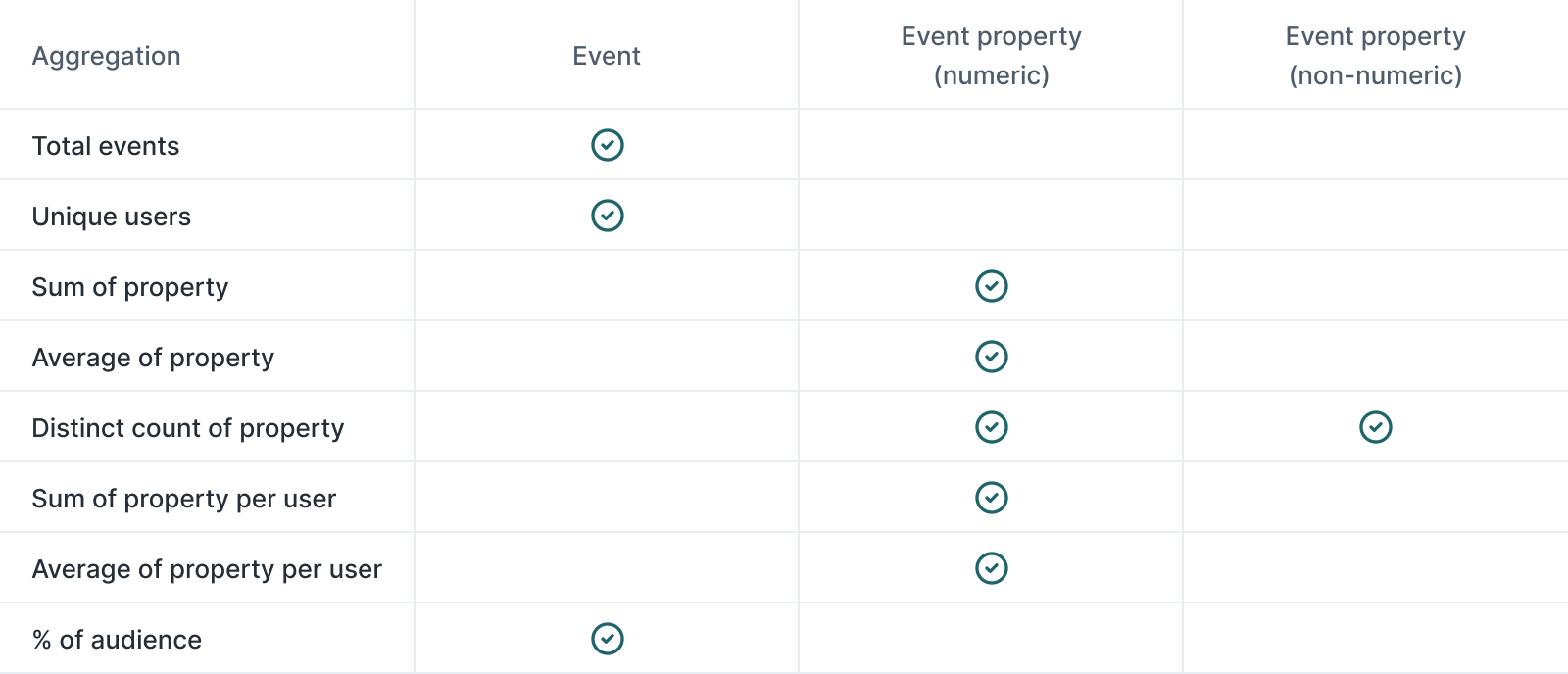
Events and event properties
Different aggregations are available depending on whether an event property is included.
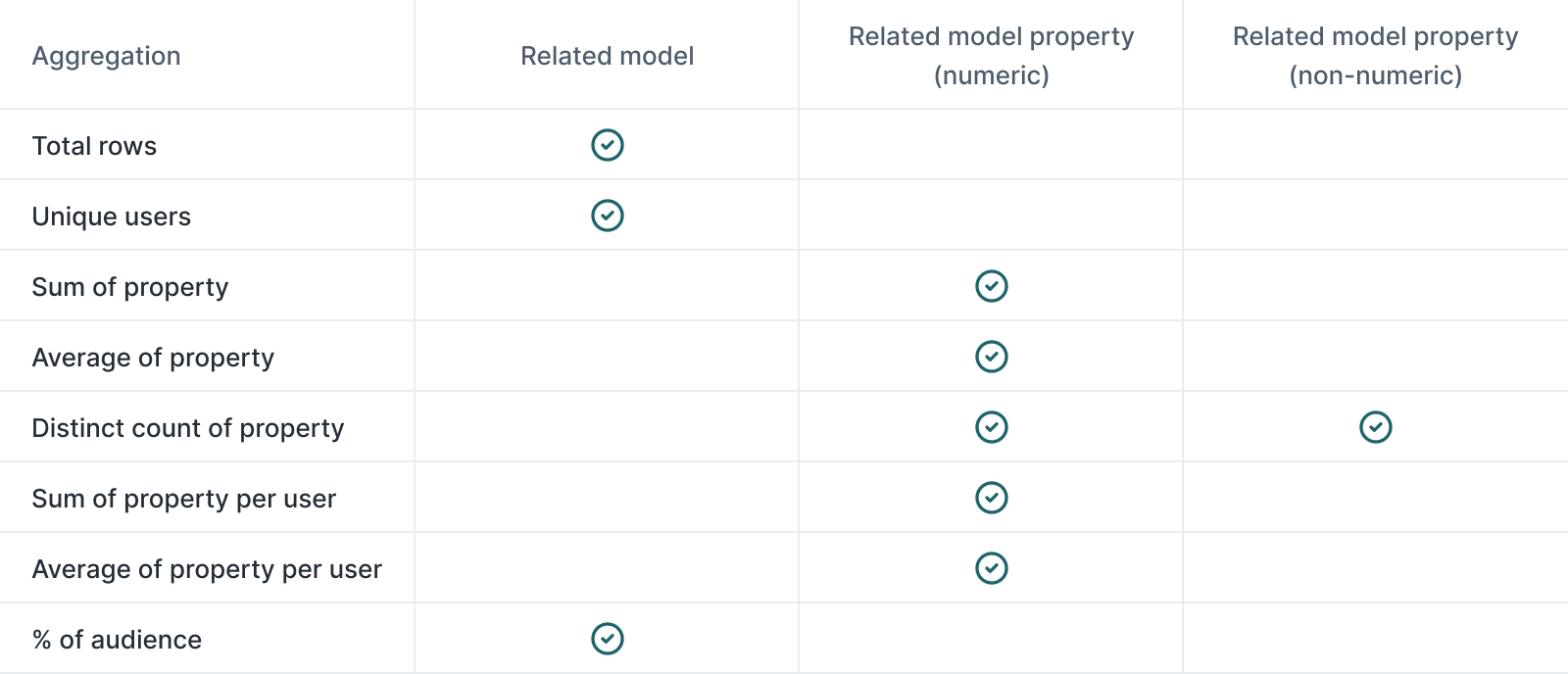
Related model and related model properties
Different aggregations are available depending on whether a related model property is included.
Properties
You can use the property you select in an aggregation on the parent model. Different aggregations are available depending on whether the member property is included.
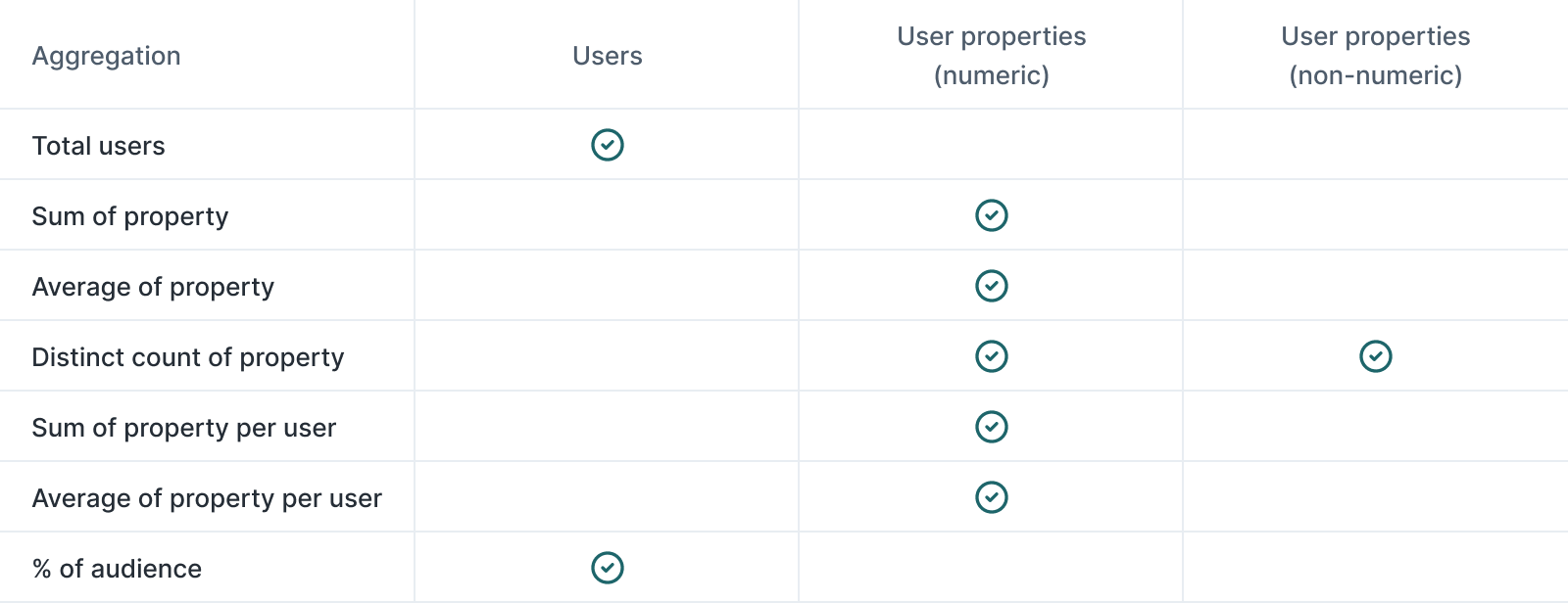
Additional filters cannot be applied, but the metric can be segmented and grouped, as detailed below.
Traits
Traits have a per-member aggregation built in, so additional aggregations can't be applied within Charts.
Segmenting and grouping
Segmenting
Segment data by one or more predefined Audiences, or create ad-hoc member segments, to focus the analysis on specific groups of members.
Grouping
Group your data based on one or more selected properties or Traits (e.g., gender, location, brand loyalty). This allows you to compare the metric across different segments of members.
Visualizations
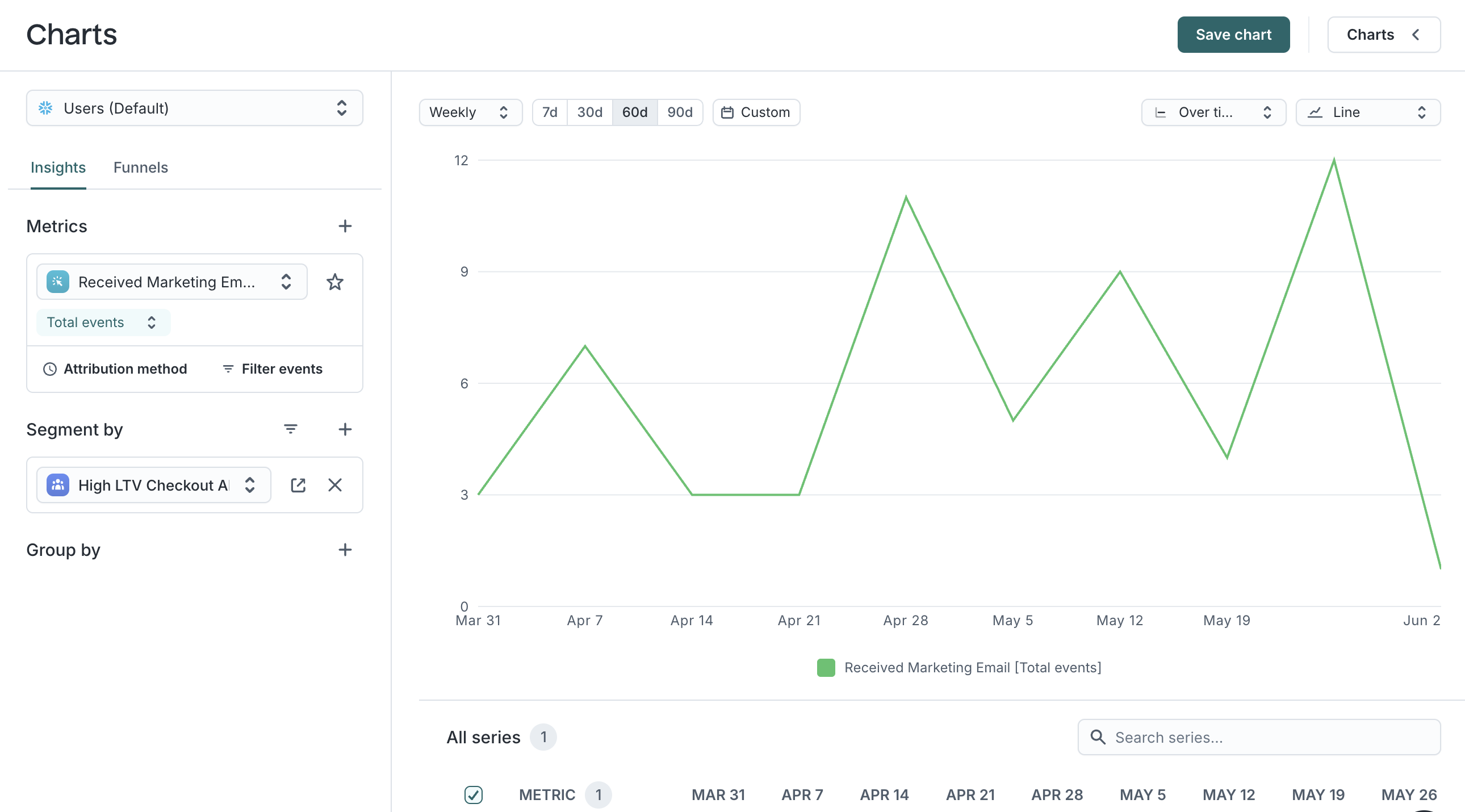
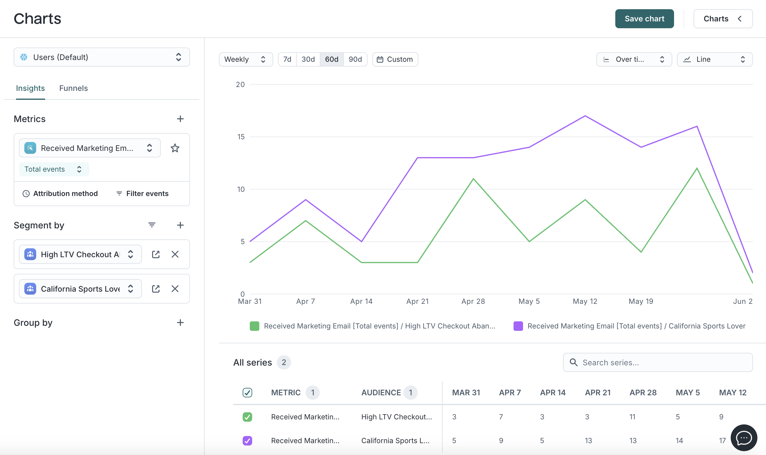
Line charts
Used to view and compare data trends over-time or cumulatively, across a selected time-frame and interval (e.g., daily, weekly). Ideal for tracking changes over time and comparing multiple series.
Examples:
How many marketing emails did I send to this audience weekly over the last 60 days?
How many marketing emails did I send to these two audiences weekly over the last 60 days?
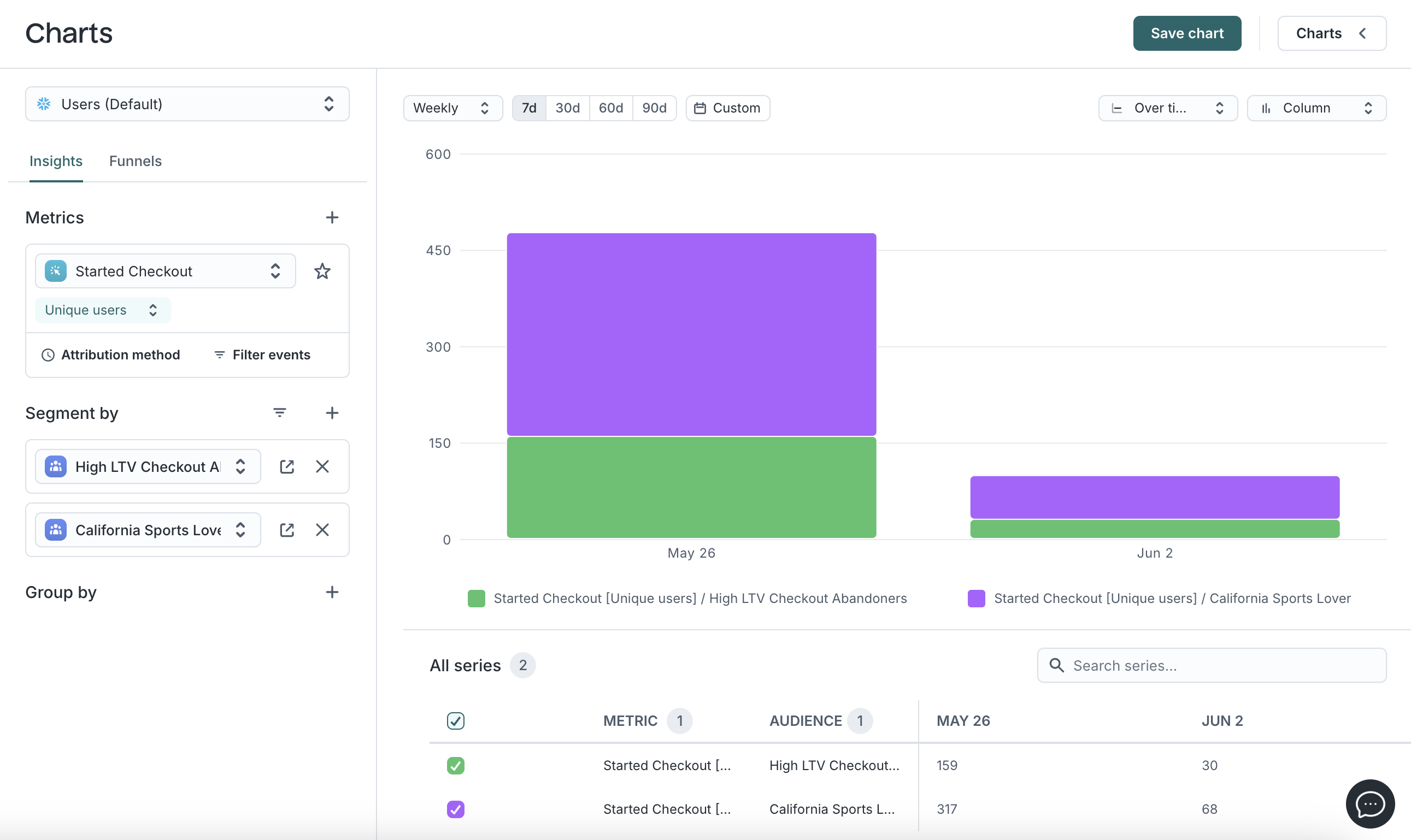
Column charts
View and compare aggregated values across categories using vertical bars. This can be done over-time or cumulatively, across a selected time-frame and interval (e.g., daily, weekly). Great for visual side-by-side comparisons.
Example: Across two audiences, how can I compare how many members of each audience have started a checkout process over the last 7 days?
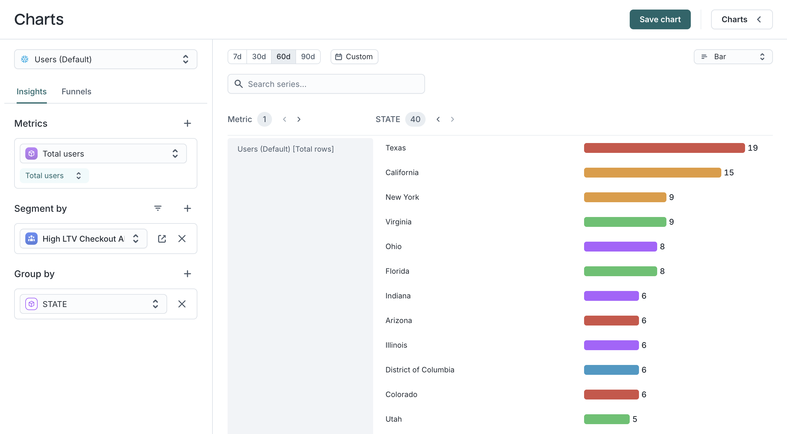
Bar charts
View and compare aggregated data across segments and groupings using horizontal bars for a given time frame. Best for top-N comparisons or summaries.
Example: How is my audience distributed by state?
Area charts
View changes in data volume over-time or cumulatively, across a selected time-frame and interval (e.g., daily, weekly). Useful for visualizing contribution trends and growth.
Example: What is the cumulative number of marketing emails sent to my audience over the last 30 days?
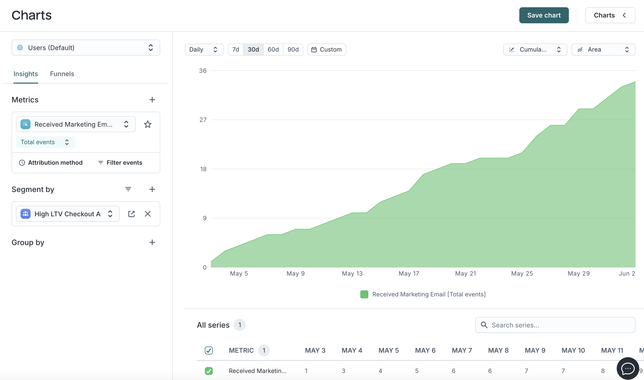
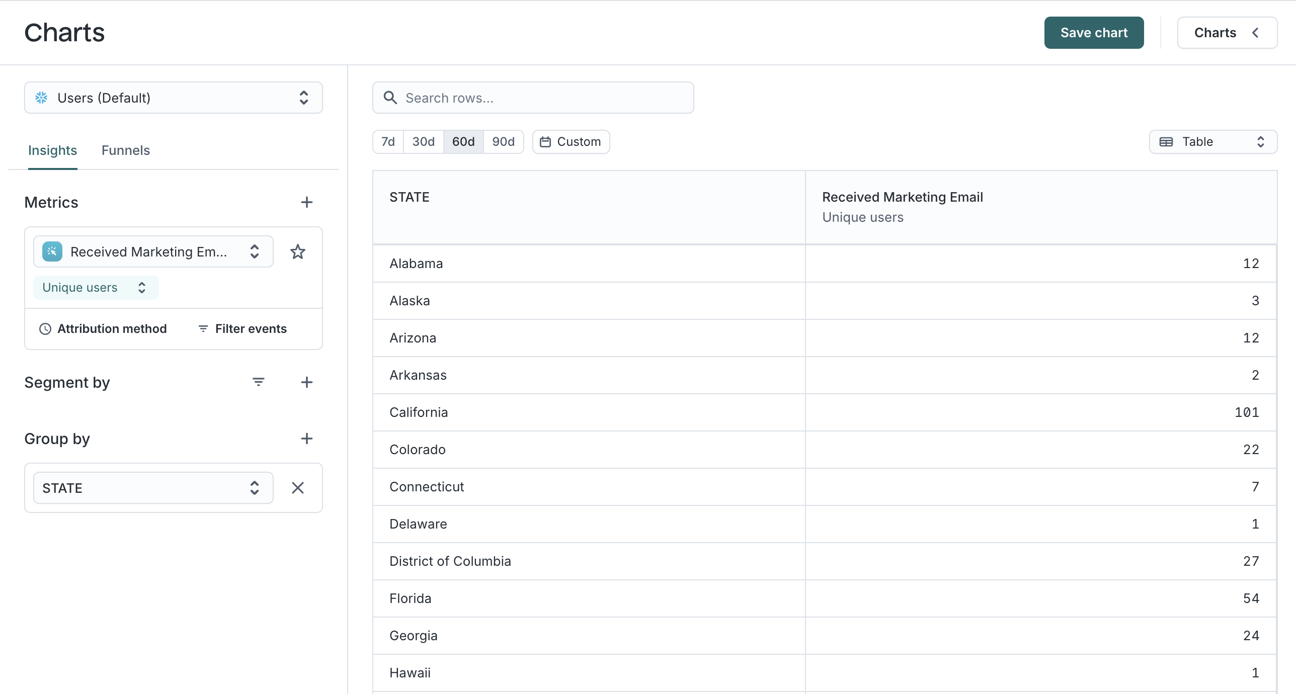
Table view
View aggregated data in rows, allowing for detailed comparison across values of a specific property for a given time-frame. Ideal for in-depth row-by-row analysis.
Example: How many members by state have received marketing emails over the last 60 days?
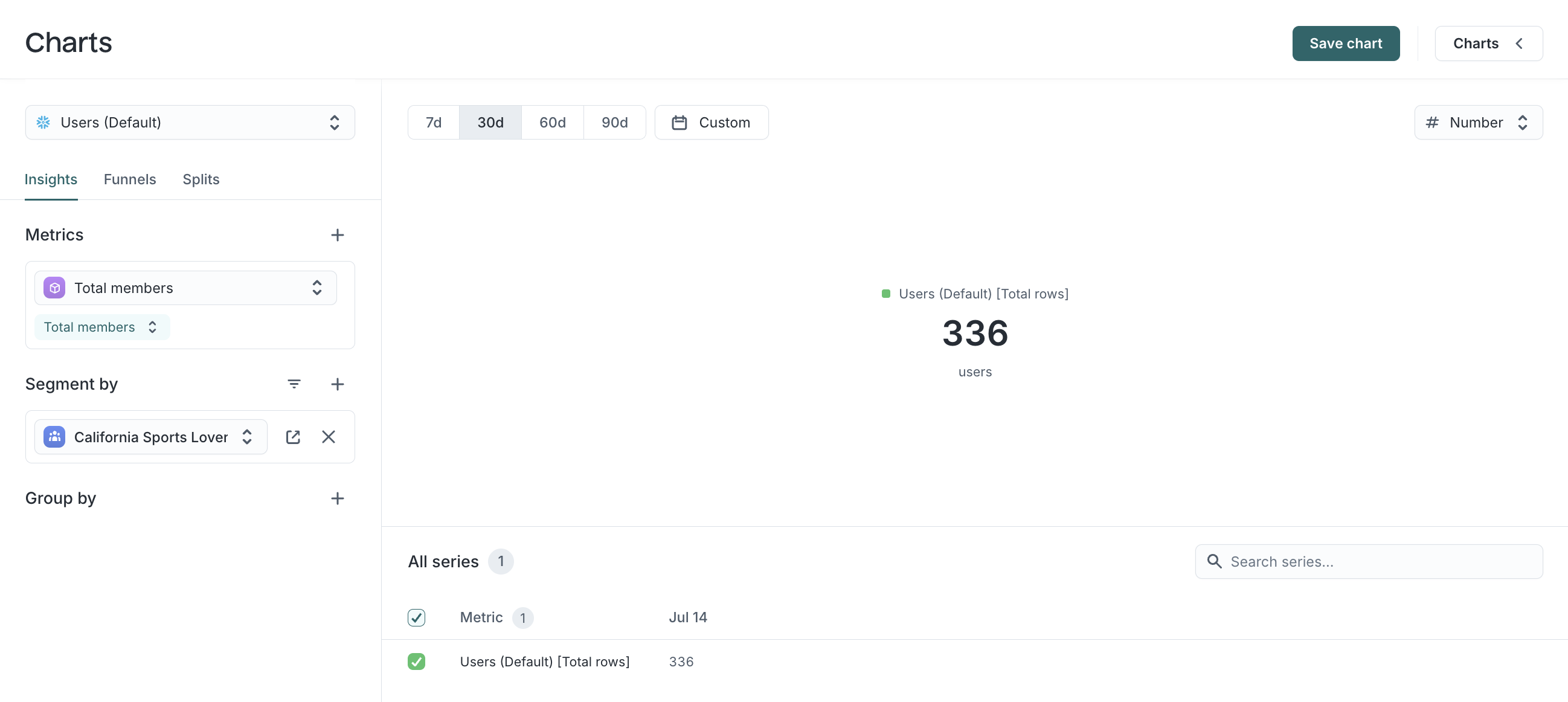
Number chart
Communicate the most important numbers at a glance, typically used on dashboards to display and track prominent metrics or key performance indicators.
Example: How many total members are in my audience?
Saving a chart
You can use the “Save chart” button to save any chart for future use. Once saved, the chart can be accessed from the Charts panel.